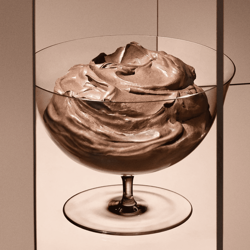
As design-forward thinkers, we believe that less is more when it comes to communication. It’s easy to fall into the trap of trying to include everything—more text, more colors, more photos—like squeezing a 10-pound turkey into a 1-pound bag. The result? An overstimulated audience, confused and frustrated, and a design that fails to make an impact.
But what if we embraced the power of white space? By intentionally leaving areas of a design open and uncluttered, we allow each element to breathe. This space gives weight to what remains, forcing us to be more selective and thoughtful in our choices. It’s not just about what’s included, but what’s left out.
A clean, uncluttered design has a powerful psychological effect. It evokes feelings of calmness and clarity in viewers, creating a positive experience that they’ll remember. And when people remember how a brand makes them feel, that’s where a real connection begins.
So next time you’re working on a design, try cutting back. Let it breathe. You might be surprised at how much stronger your message becomes.


